Through user experience research (UXR) initiatives that take into account our diverse membership and community, we can have a continuous, deeper understanding of the role of metadata in our members’ workflows, and ensure that our work continues to meet our community’s needs. Your support is the key to this process, and will positively impact the wider community - and if you’d like to start today, you can take part in our latest initiative: help us improve our Events page by sharing your thoughts on the page’s feedback form.
Our 2026 Community Update took place on 13 May. Two calls, one for the eastern and one for the western time zone, highlighted how our global community is growing, how we’re refining the metadata that supports trust in the scholarly record, and connecting records more effectively through our latest tools.
Funding is one of the key enablers of the research lifecycle, but has been one of the hardest parts of the scholarly record to identify, describe and connect. This is slowly changing as we have recently reached a very exciting milestone for Crossref’s Grant Linking System (GLS). What makes it remarkable is not only the numbers reached, but where the data comes from. Research funders, who joined Crossref as members, have actively contributed more than 200,000 grants to the Research Nexus (Figure 1).
We are pleased to announce the re-launch of the Crossref Service Providers Program. From today, we are accepting applications from organisations providing tools for metadata registration to Crossref members. Participation in this program is free and the application involves an accreditation process to determine eligibility and the appropriate participation tier.
As a membership organisation, Crossref supports its members to provide rich and complete metadata which facilitates integrity judgements, increases discoverability, linking among scholarly objects and activities, and improves transparency. Service providers are key collaborators in this work because they enable our members to adopt better metadata practices.
The rebranding of Crossref was top priority when I joined in May in a new role called “Director of Member & Community Outreach”. Since then I’ve been working to understand the array of services, attributes, and audiences we have developed; to answer the questions “What do we do, for whom, and why?”
As Crossref prepares to celebrate turning fifteen at our annual meeting next week, I am thrilled to present our new brand identity with key messages and logo. And along with “thrilled” you may also detect “nervous excitement”.
Over the last few months we have reviewed earlier research and talked with a number of members, affiliates, and academics. Turns out we’re the plain talkers of the industry, the do-ers, the scrappy people who get stuff done, chivvy others along, and in some cases we are—dare I say it—the voice of reason!
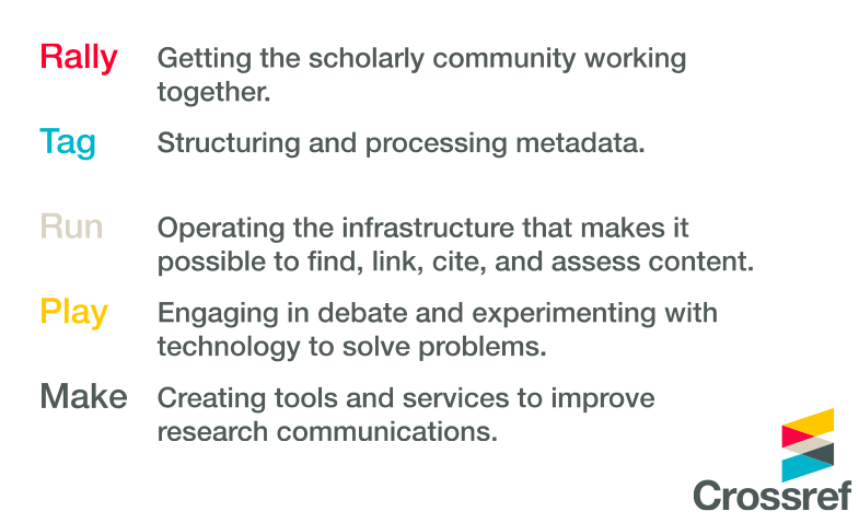
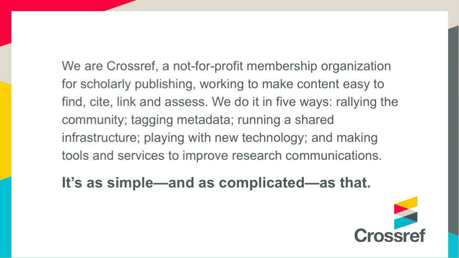
While balancing differing views within the scholarly community, we’re all about making connections – literally and figuratively. We help bring together people and metadata in pursuit of an excellent research communications system for all. And, to mirror one of Ed Pentz’s new catchphrases, we are “keeping it real”; with down-to-earth language.
Crossref Key Messages
New logos and names for all our products will come soon (in some cases it’ll be a ‘de-brand’ rather than a re-brand!). We’ll gradually phase in the new identity over the next month or two, starting with our annual meeting, and with a complete website relaunch following in 2016. We will contact all of our members and partners in the coming weeks with information about using the new logo, using a content delivery network (CDN) so that sites can reference the correct file.
Why rebrand?
We have not rebranded because we plan on doing something different but rather to better express the things we already do. Our ‘problem’ was that often people didn’t know Crossref was behind initiatives like CrossCheck, Crossmark and FundRef. Our products had become unlinked from the organisation. And since we’re all about linking things together, that just made no sense.
We needed an icon to give more flexibility across the web that a word mark cannot do alone. The icon is made up of two interlinked angle brackets familiar to those who work with metadata, and can also act as arrows depicting Metadata In and Metadata Out, two themes under which our services can generally be grouped.
Sentence case helps to avoid splitting the word; we do not want to tempt the Cross and the Ref to divide again. So that lowercase R you see in the middle of our name is indeed an official change. (Hopefully we can change the habit!)
The palette gives a nod to the history of Crossref with red & dark grey, but brings in contemporary colors for a fresh palette that is distinctive in our industry (we researched a lot - everyone has circles, and traditional shades abound). Our aesthetic embodies classic Swiss design principles and is minimalist in keeping with our straight-talking personality.
So, in the words of Board Chair, Ian Bannerman, it’s time for Crossref to step forward.
About Crossref
I’m looking forward to revealing more of the story at our annual meeting next week!